
Component
Magnetic Hover Tooltips in Framer
This is a Magnetic Hover Tooltips component for Framer, recreated from Akash’s original work, combining a magnetic pull with a subtle 3D tilt effect. Feel free to remix the file to explore how it’s built or simply copy the component into your project.


About the resource
To recreate this, I first created a tooltip component with default and hover variants. I added the button, then connected the image tooltip element to the 3D Look component to get that slight tilt interaction. For the magnetic effect, I added Hover Force component to the button.
After that, I wrapped both elements inside a larger holder frame, and then wrapped everything again to neatly fit the button and holder together. On this top layer, I added an Appear effect. In the default variant, this layer is set to visible: no. On hover, it switches to yes, which triggers the appear animation along with the hover interaction across both variants.
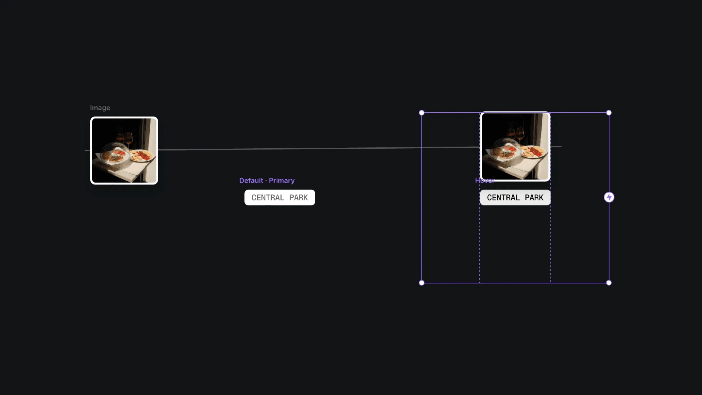
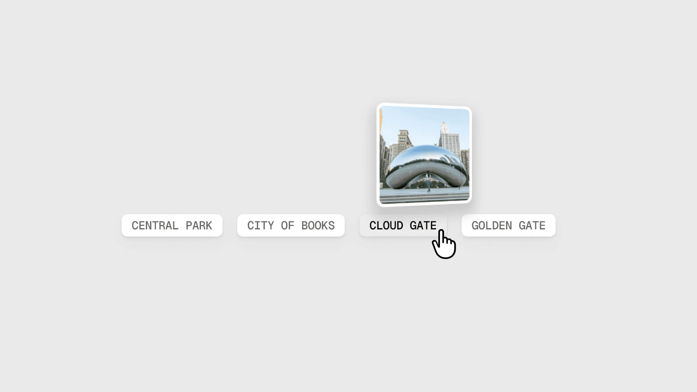
The default and hover variants of tooltip component in Framer.
The default and hover variants of tooltip component in Framer.
The default and hover variants of tooltip component in Framer.


