
Component
Unexpected Surprises on Hover in Framer
This is an unexpected surprises on hover animation, recreated from Griflan's website in Framer. It uses a playful hover, so you can remix the project to see how the interaction is built or copy the component straight into your own project.


About the resource
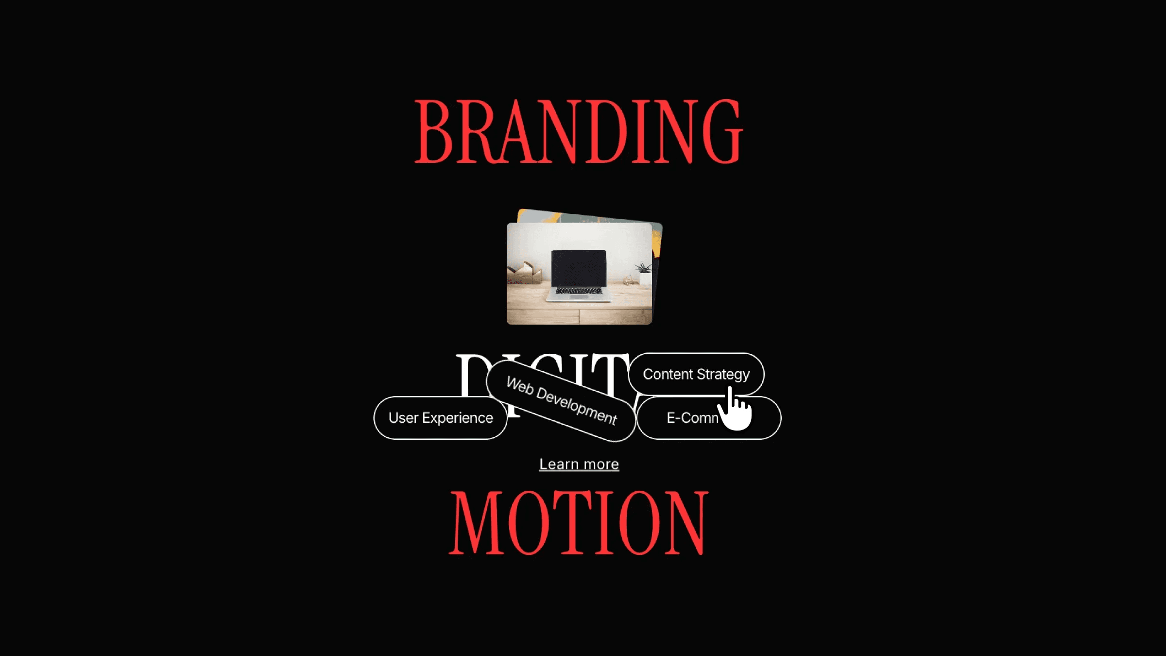
To create Unexpected Surprises on Hover in Framer, I built a single component with two variants: default and hover. In the default state, all content sits inside a text layer, with the tag elements positioned on top of it and set to zero opacity. On hover, the tags move to the bottom of the text layer, which makes them feel like they drop in from above.
The two images live behind the text frame and animate in with a staggered feel. This is done by overriding the transition on each image and adding a small delay to one of them. Finally, the two variants are connected using mouse enter and mouse leave interactions, keeping the setup simple while creating a playful, surprising hover effect.
About the resource
To create Unexpected Surprises on Hover in Framer, I built a single component with two variants: default and hover. In the default state, all content sits inside a text layer, with the tag elements positioned on top of it and set to zero opacity. On hover, the tags move to the bottom of the text layer, which makes them feel like they drop in from above.
The two images live behind the text frame and animate in with a staggered feel. This is done by overriding the transition on each image and adding a small delay to one of them. Finally, the two variants are connected using mouse enter and mouse leave interactions, keeping the setup simple while creating a playful, surprising hover effect.
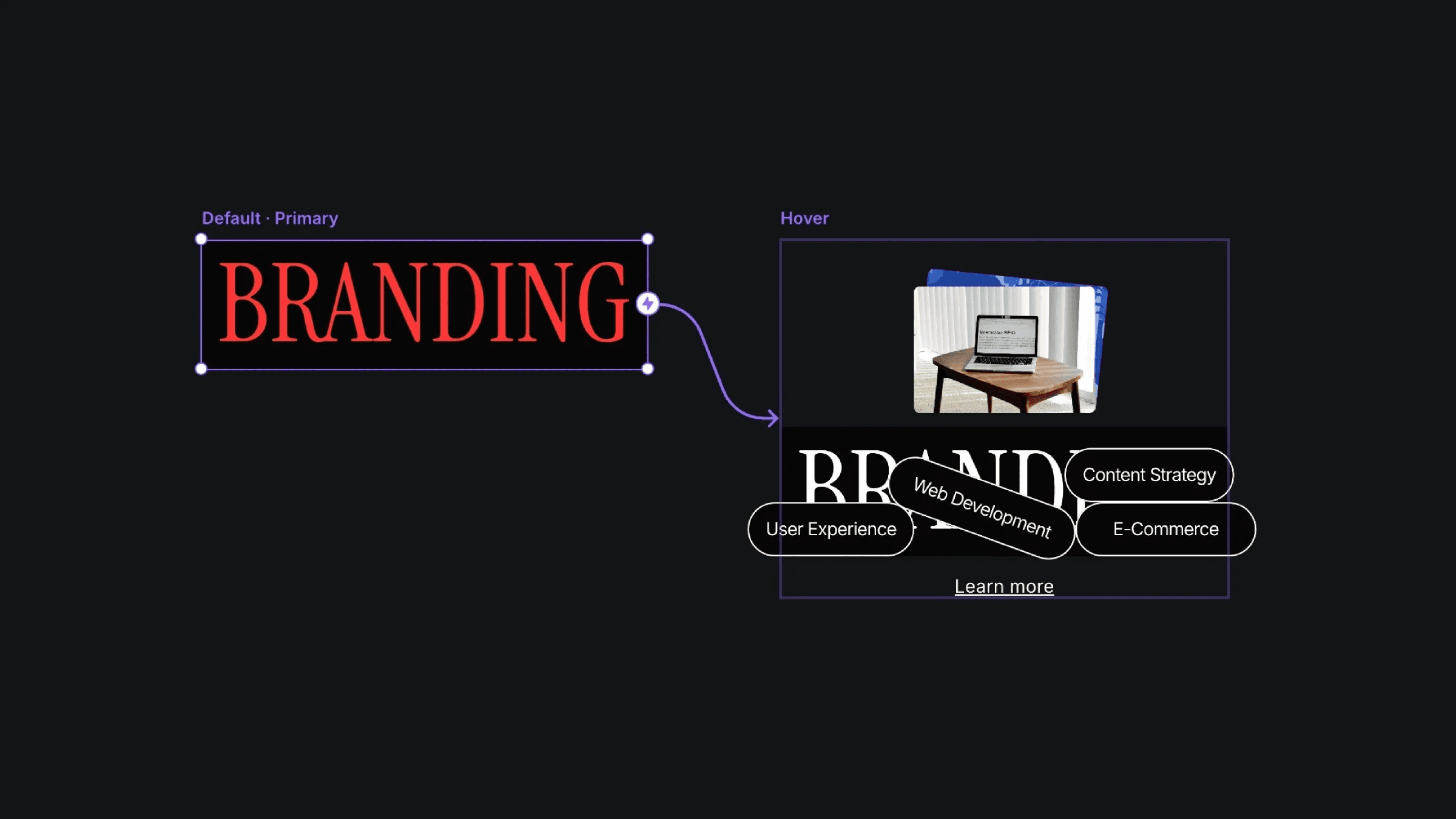
The default and hover variants of the surprise hover component.
The default and hover variants of the surprise hover component.
The default and hover variants of the surprise hover component.


