
Component
Stacked Dropdown Animation in Framer
This is a stacked dropdown animation recreated in Framer, inspired by Friso’s original work. Feel free to copy the component or remix the project to explore how such animations are built in Framer without using any code.


About the resource
To create the stacked dropdown animation, I used a simple two-variant setup with a closed and an open state. In the closed state, each dropdown item is absolutely positioned and its width is reduced by 5% compared to the one above it, which creates the layered depth effect. In the open state, the items switch to relative positioning and expand to 100% width, forming a clean stacked layout with a subtle 3D feel.
The interaction is wired by adding a click trigger on the first item that toggles between the two variants, keeping the setup minimal and easy to recreate in Framer.
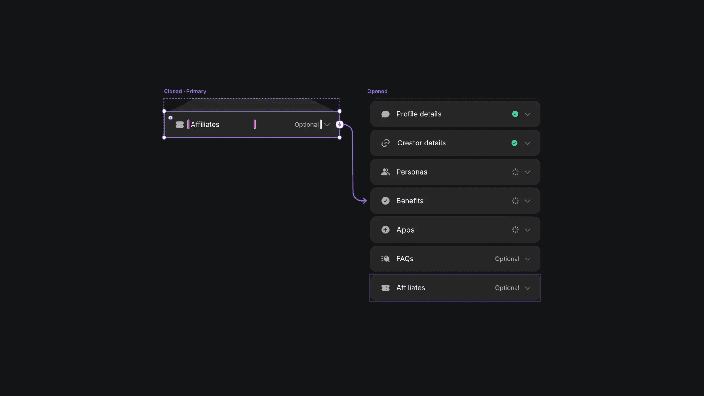
The closed and open variants of the dropdown component.
The closed and open variants of the dropdown component.
The closed and open variants of the dropdown component.


