
Component
Rotation Button Hover in Framer
This is a 3D rotation button hover component recreated in Framer from Widya’s original work. You can remix the project, tweak the rotations and bounce settings, or copy the component straight into your own site to add a playful spin interaction.


About the resource
To create this Rotation Button Hover component in Framer, I set it up inside a 3D space using the arms technique.
I used three arms: one for the default text, one for the fill frame, and one for the hover text that animates in. Each arm is positioned at 200% relative and rotated at different angles; 0°, -18°, and -35° so they sit in a stacked circular arrangement.
In the default state, the content inside the second and third arms is set to opacity 0. On hover, their opacity switches to 1 and their rotation animates to 0°, so everything aligns perfectly in the center. At the same time, the default text rotates further upward to around 25°, moving out of view.
I also used a helper text frame to define the button’s size and set the parent container to absolute 3D space to maintain proper perspective and layering.
For the animation, I connected variants with a hover interaction and applied a bouncy transition for that energetic feel. The hover text and fill animation have a slight delay and a slightly reduced bounce, achieved by overriding the transition on those specific arms in the hover variant — making the motion feel layered and intentional.
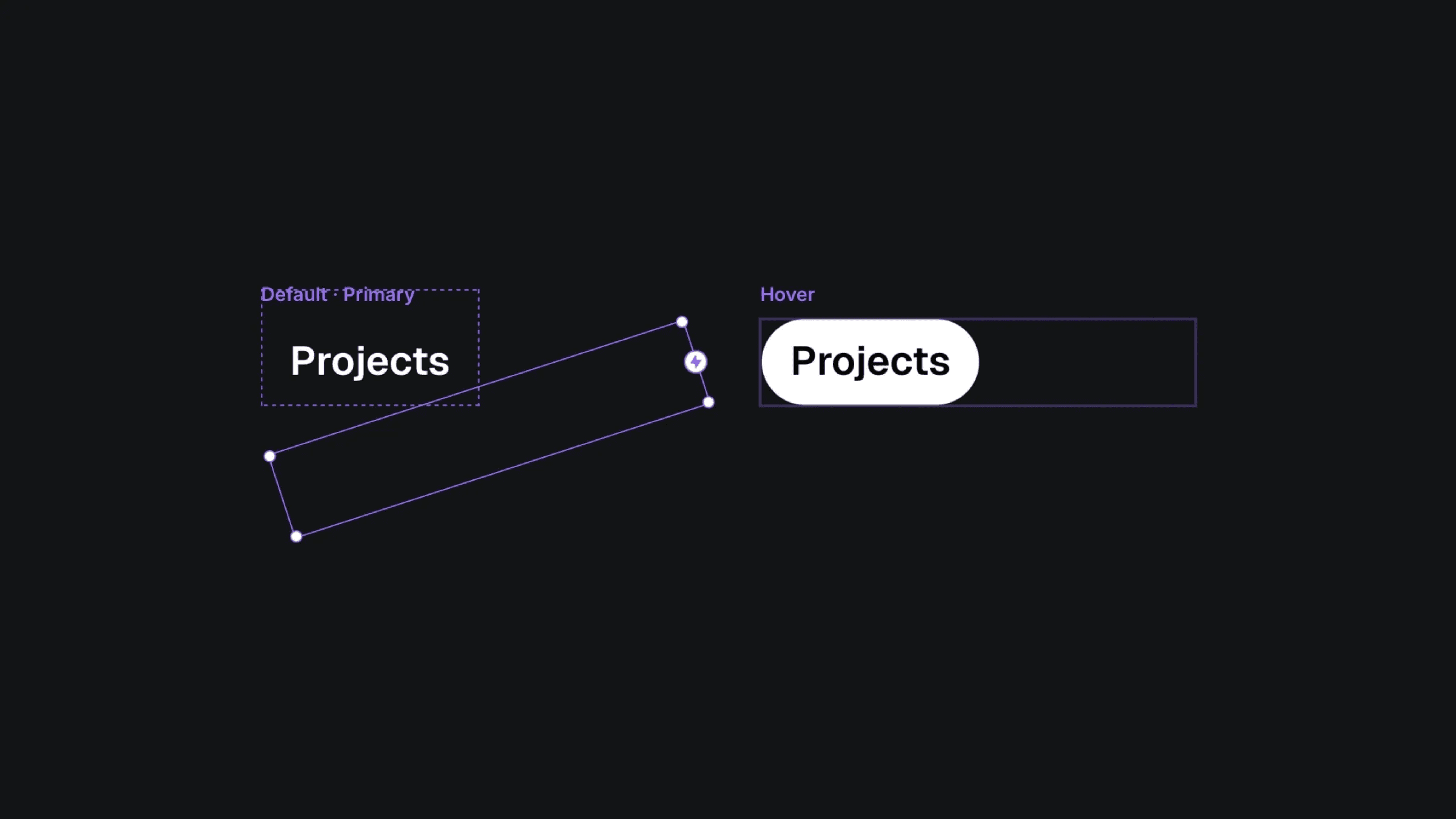
The default and hover varaints of the rotation button component.
The default and hover varaints of the rotation button component.
The default and hover varaints of the rotation button component.


