
Component
Playlist Generation Circular Animation in Framer


About the resource
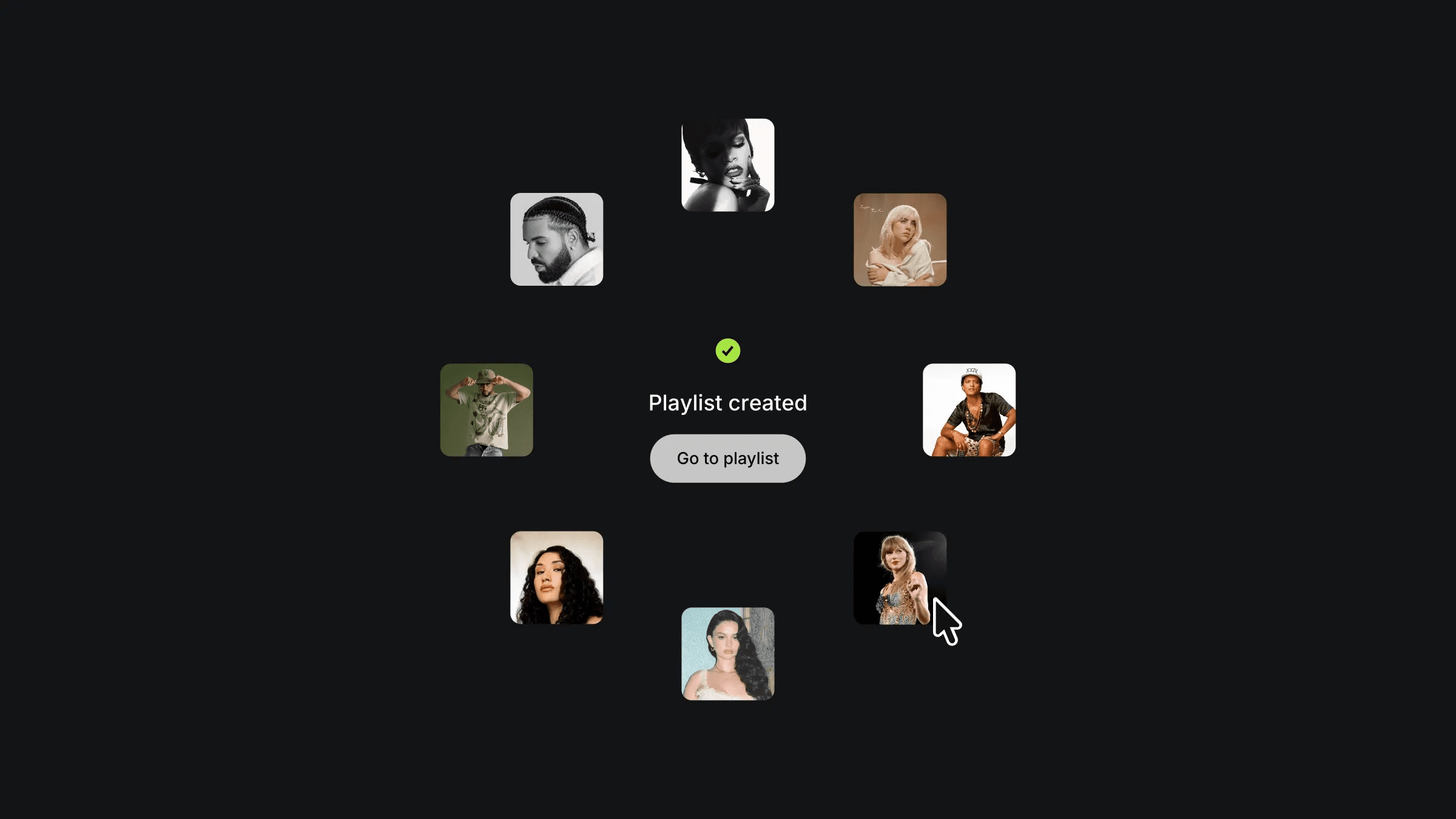
To create this animation, I built a component with three variants, Default, Loading, and Playlist, triggered through click and appear interactions. Key elements like the button and loading icon are components themselves, each carrying their own matching variants so every part of the UI shifts in sync according to the animation state.
The images start stacked at the center at opacity 0, then animate outward into a circular formation on the Playlist variant. The staggered entrance, each image arriving one by one, is handled by overriding the transition properties individually on each image, assigning incremental delays for precise choreography.
Each image in the circle is also paired with a parallax floating component, adding a subtle depth response on hover so the final state feels alive rather than static once the animation settles.
About the resource
To create this animation, I built a component with three variants, Default, Loading, and Playlist, triggered through click and appear interactions. Key elements like the button and loading icon are components themselves, each carrying their own matching variants so every part of the UI shifts in sync according to the animation state.
The images start stacked at the center at opacity 0, then animate outward into a circular formation on the Playlist variant. The staggered entrance, each image arriving one by one, is handled by overriding the transition properties individually on each image, assigning incremental delays for precise choreography.
Each image in the circle is also paired with a parallax floating component, adding a subtle depth response on hover so the final state feels alive rather than static once the animation settles.
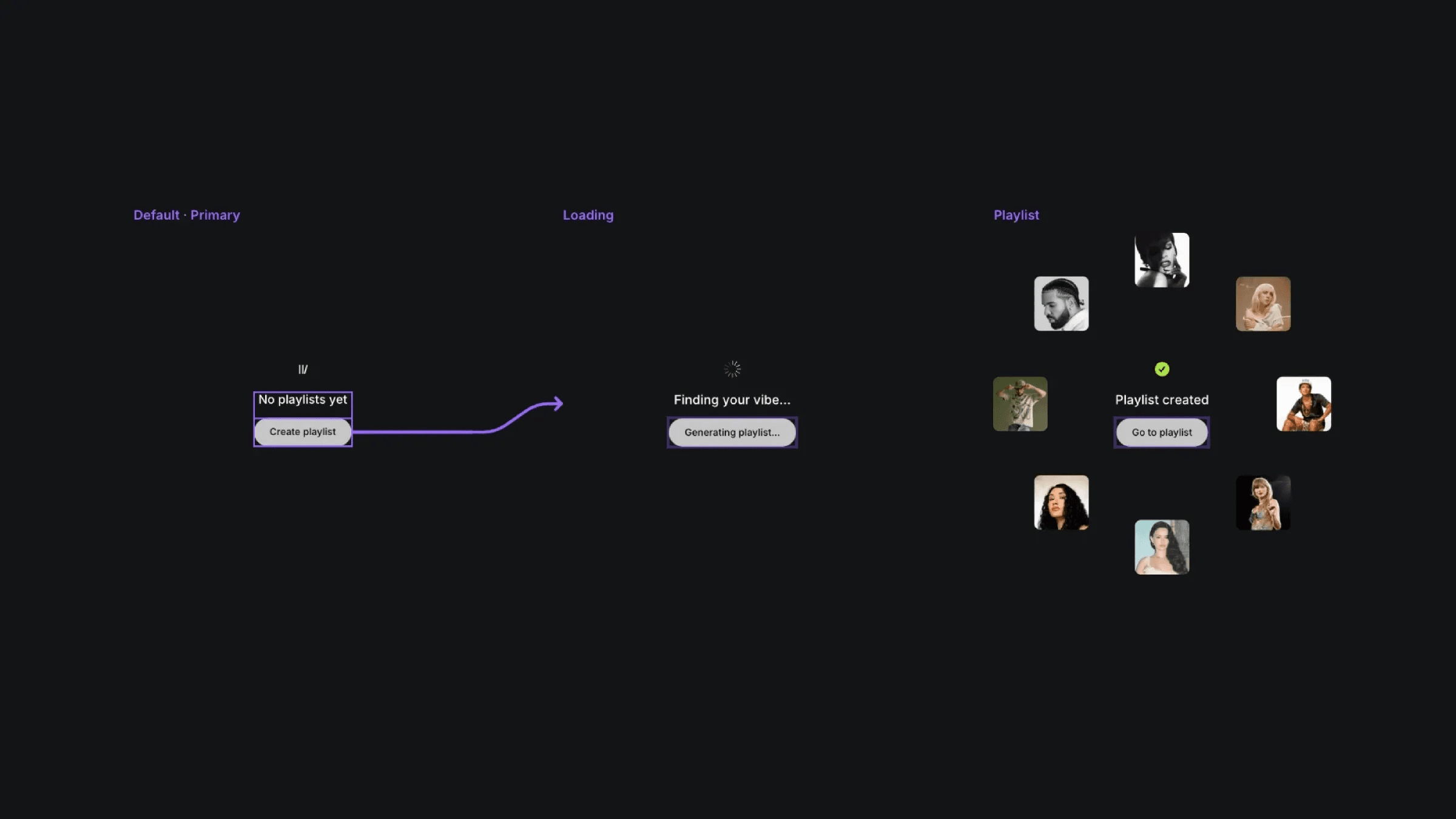
The three variants of the playlist component.
The three variants of the playlist component.
The three variants of the playlist component.


