
Component
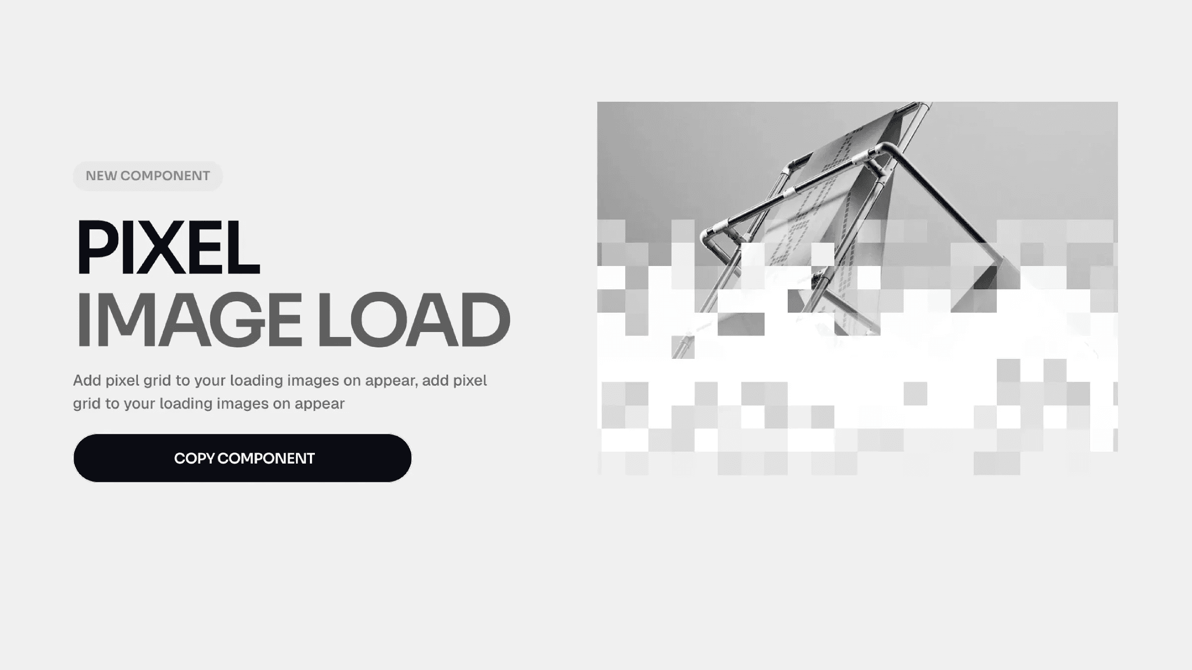
Pixel Image Load Effect in Framer
This is a Pixel Mask Reveal component for Framer, recreated from Chakib’s work. It reveals images through a pixelated transition effect. You can copy it directly into your project and create the interaction without writing any code.


About the resource
To use the component, add your image and control how it reveals through a pixel mask effect directly in Framer. Previewlets you toggle the animation in the canvas, on to play it, off to keep it static while designing.
The Image field is required and sets the source for the effect. With Mode, you choose when it runs: Appear (plays once on load) or Layer in View (triggers on scroll). If you select Layer in View, Start At controls where the trigger begins, and Replay decides whether it animates again when re-entering the viewport.
Grid Size adjusts how fine or chunky the pixel grid looks. Duration and Delay control the timing. Direction sets where the reveal comes from, Radius applies border radius, and Pixel Tint adds a color overlay to the revealed pixels.
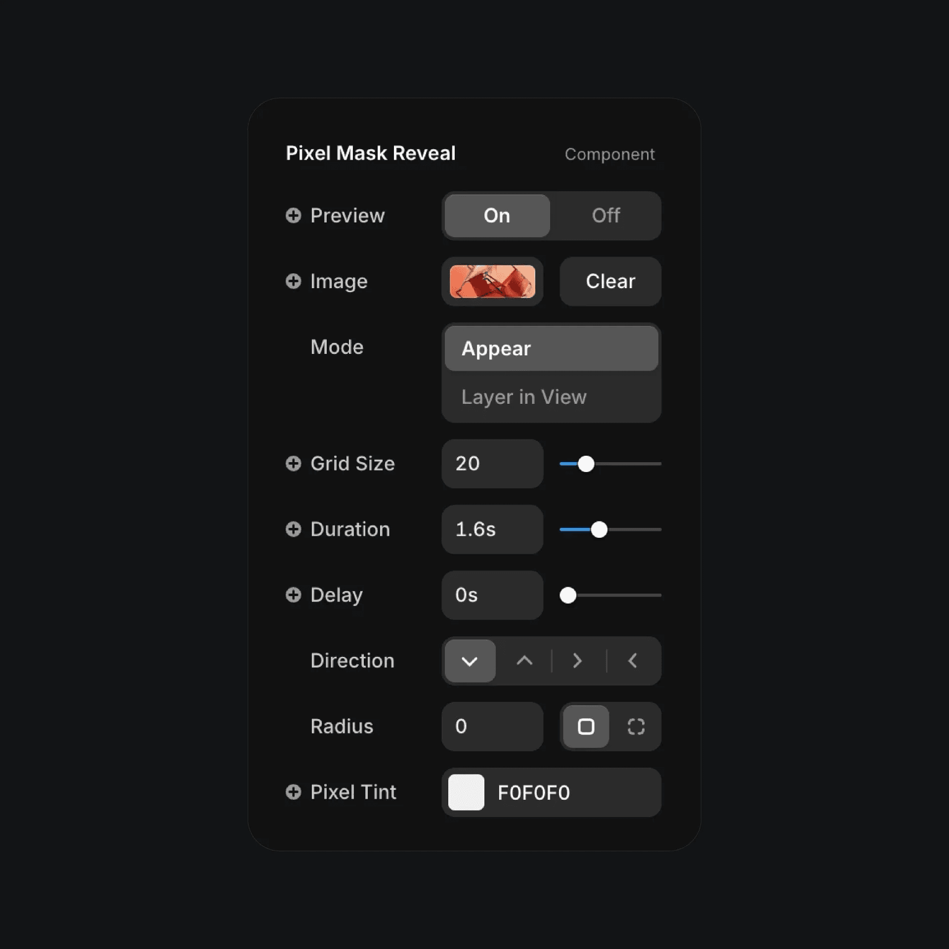
The pixel mask reveal component properties in Framer.
The pixel mask reveal component properties in Framer.
The pixel mask reveal component properties in Framer.


