
Component
Icon to Modal Animation in Framer
This is an icon to modal animation recreated in Framer from the original work by Alexander Avdeev. It showcases a smooth transition from a compact icon into a full modal. Feel free to remix the project and explore how the interaction is structured.


About the resource
To create this interaction, I started by breaking it into three simple components: the icon, the modal, and a combined icon-to-modal setup.
The icon itself has three variants: a default state, a hover state, and an expanded state where the icon scales up. The modal is kept minimal with two variants: a default state and a scaled-down version where it shrinks slightly and fades out.
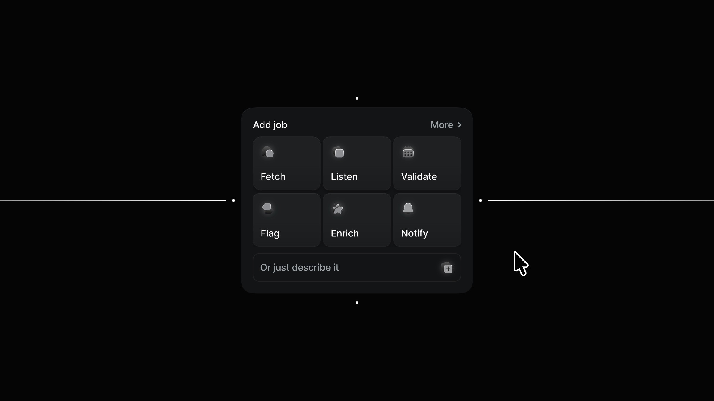
Then both are brought together in the icon to modal component, which has just two variants: default and clicked. In the default state, the icon sits in its normal state and responds to hover. Once you click the icon, it transitions to the clicked variant, the icon expands, and the modal appears in its default state. Clicking again simply takes everything back to the starting point. The whole setup stays straightforward while clearly showing how the interaction works.
About the resource
To create this interaction, I started by breaking it into three simple components: the icon, the modal, and a combined icon-to-modal setup.
The icon itself has three variants: a default state, a hover state, and an expanded state where the icon scales up. The modal is kept minimal with two variants: a default state and a scaled-down version where it shrinks slightly and fades out.
Then both are brought together in the icon to modal component, which has just two variants: default and clicked. In the default state, the icon sits in its normal state and responds to hover. Once you click the icon, it transitions to the clicked variant, the icon expands, and the modal appears in its default state. Clicking again simply takes everything back to the starting point. The whole setup stays straightforward while clearly showing how the interaction works.
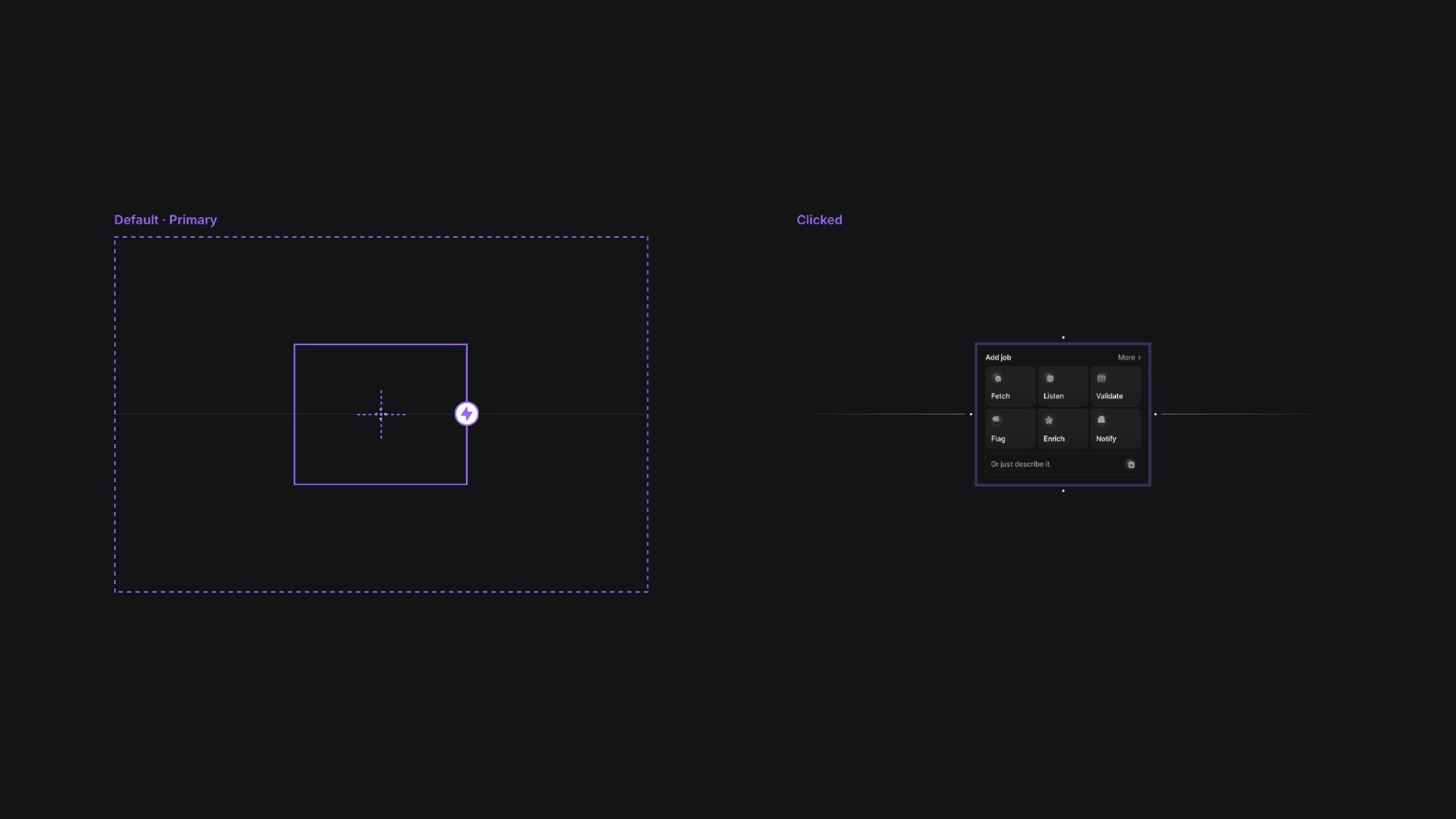
The two variants of the icon to modal component.
The two variants of the icon to modal component.
The two variants of the icon to modal component.


