
Component
Holo Card Animation in Framer
This is a holo card animation recreated in Framer, inspired by Oğuz and Necati’s holo card effect. The best part? the entire effect is recreated without writing a single line of code, showing just how powerful Framer can be for designers.


About the resource
This card is similar to the Holographic 3D Cards component. The holo effect is created by stacking multiple visual layers, each with carefully tuned opacity, blending modes, and z-index values to simulate depth and light.
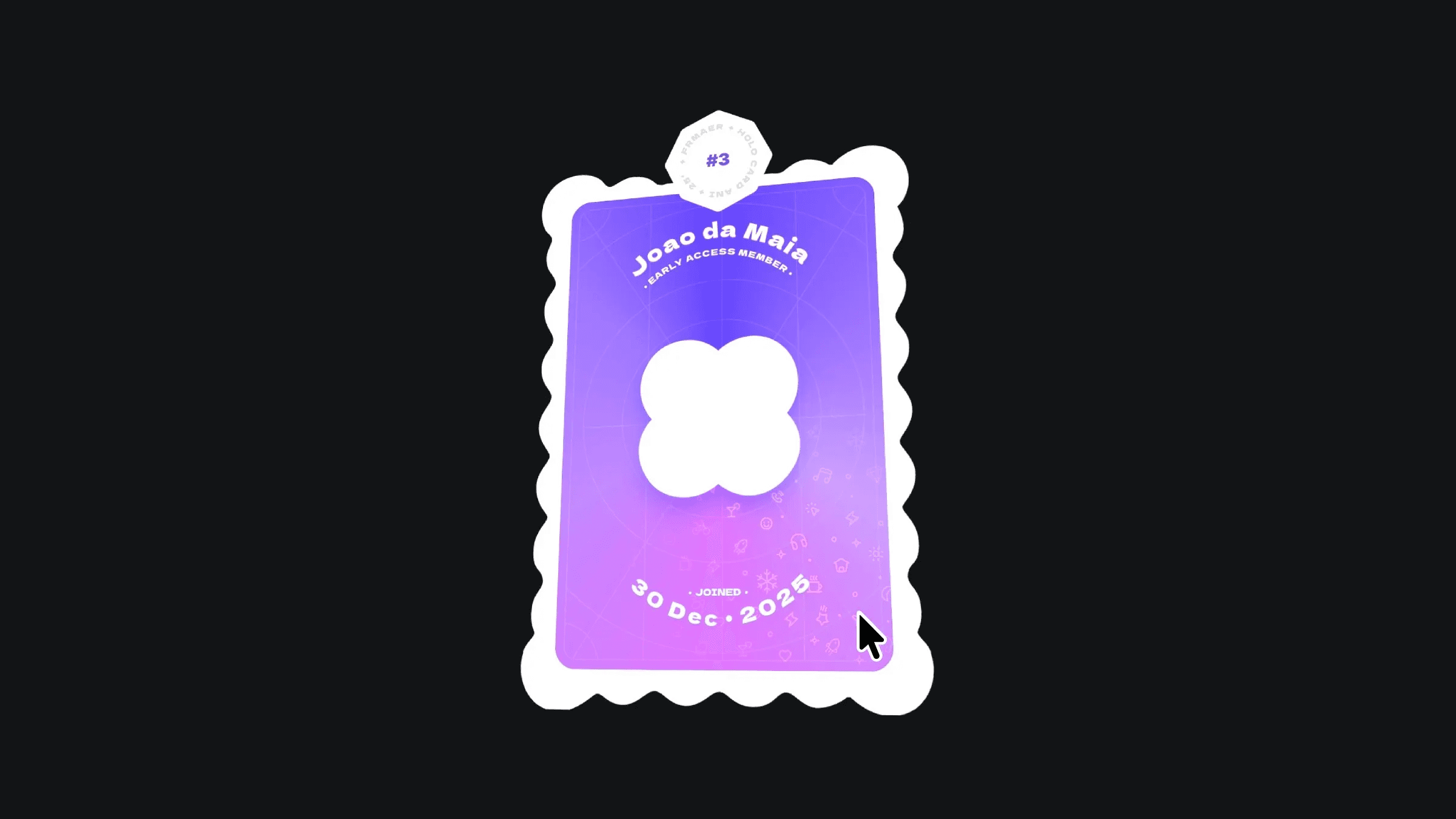
The card component has two variants: default and hover. When you hover over the card, the holo highlights and icon pattern become visible, creating the reveal effect.
Inside the highlight layers, a Follow Cursor component is added. One highlight uses a radial gradient, and the other uses a rainbow linear gradient. Both are connected to the Parallax Floating component to add gentle motion, which creates the shifting holographic shine. An icon pattern layer is then blended on top and set up so the icons appear only when the moving highlights pass over them.
After the visual layers are ready, the card is connected to the 3D Hover component. To connect the card with the component, place the component inside canvas, move the card component layer outside, and connect it to the 3D Hover component. Once connected, the 3D tilt works automatically, giving the card a smooth, interactive hover effect without any extra setup.
About the resource
This card is similar to the Holographic 3D Cards component. The holo effect is created by stacking multiple visual layers, each with carefully tuned opacity, blending modes, and z-index values to simulate depth and light.
The card component has two variants: default and hover. When you hover over the card, the holo highlights and icon pattern become visible, creating the reveal effect.
Inside the highlight layers, a Follow Cursor component is added. One highlight uses a radial gradient, and the other uses a rainbow linear gradient. Both are connected to the Parallax Floating component to add gentle motion, which creates the shifting holographic shine. An icon pattern layer is then blended on top and set up so the icons appear only when the moving highlights pass over them.
After the visual layers are ready, the card is connected to the 3D Hover component. To connect the card with the component, place the component inside canvas, move the card component layer outside, and connect it to the 3D Hover component. Once connected, the 3D tilt works automatically, giving the card a smooth, interactive hover effect without any extra setup.
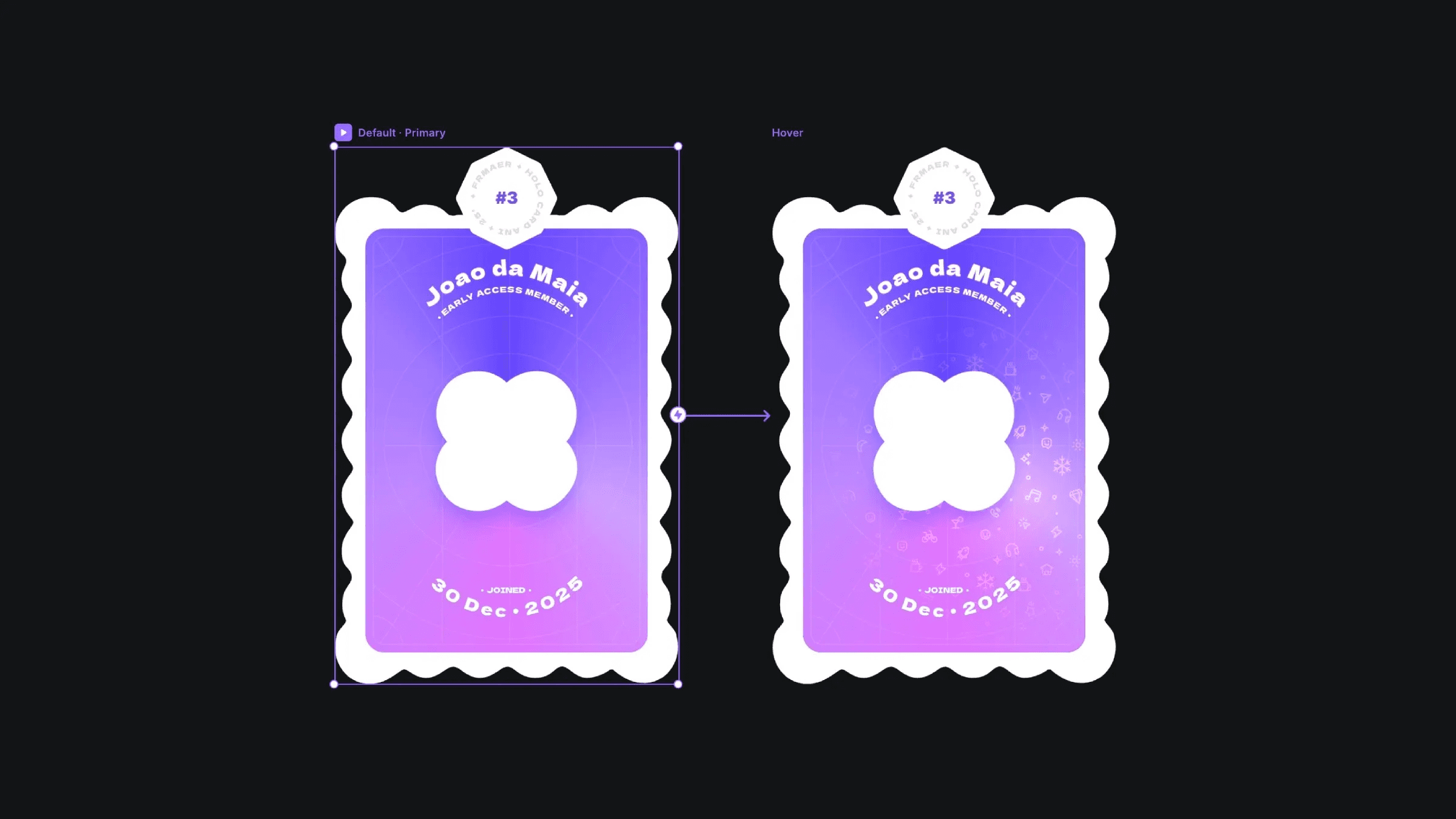
The default and hover variants of the holo card component.
The default and hover variants of the holo card component.
The default and hover variants of the holo card component.


