
Component
Dark/Light Color Theme Toggle in Framer
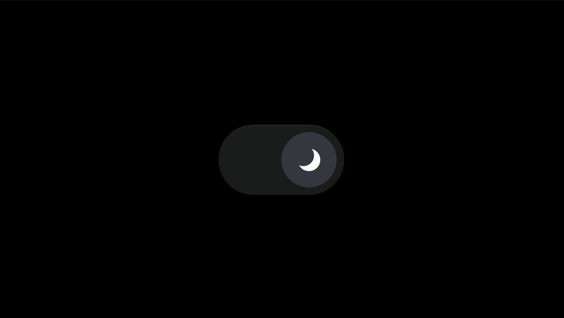
This is a dark / light theme toggle for Framer, recreated from Илья Бабушкин’s work, that lets users switch between light and dark color themes using native color styles, without depending on system theme settings.


About the resource
This is a Dark / Light color theme toggle for Framer that lets you control your entire page theme with a simple switch. To use the component, you set up color styles in Framer with a light mode version and a dark mode version. For example, the dark mode version of a color style can be set to white, and the light mode version to black. By default, Framer already knows how to switch between these color styles when a theme changes.
The Theme property controls which theme is active on the page. Selecting Light applies all light theme colors and tokens, while Dark applies the dark ones. Once the toggle is added to your site, users can switch between light and dark modes directly from the interface, without needing to change their system-level theme settings.
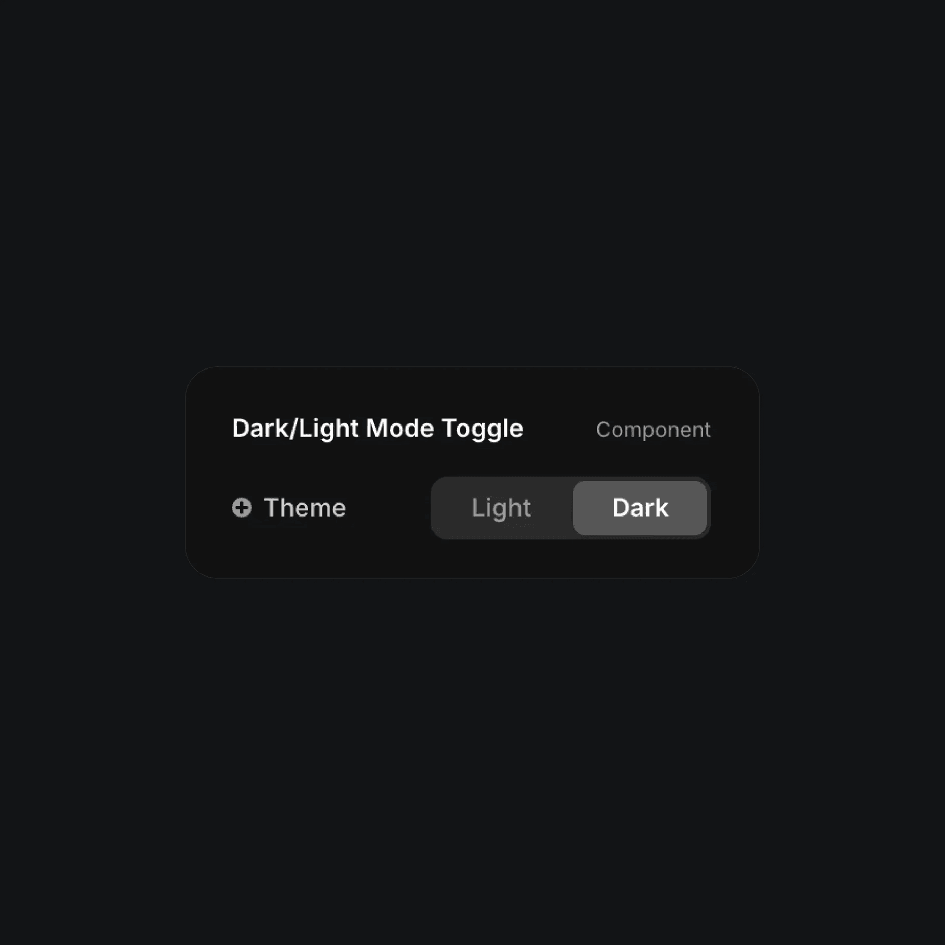
The dark/light mode toggle component properties in Framer.
The dark/light mode toggle component properties in Framer.
The dark/light mode toggle component properties in Framer.


