
Component
Blob Image Reveal Component for Framer
This is a Blob Image Reveal component recreated in Framer from Arlind Aliu’s original work, giving you a smooth organic reveal animation that you can easily plug into any section or layout. You can copy it into your projects and customise the reveal however you like.


Created by

o use the component, just drop the Blob Image Reveal onto your canvas and tweak everything from the right panel. Preview lets you choose whether you want to see the full blob animation while designing or just the fully revealed image. For the Image control, you can pick anything from your assets or upload a new one, and the blob effect will handle the reveal.
Blob Count decides how many blobs animate in go high for a layered, complex reveal or low for a simple, single-blob moment. Radius lets you round the corners of the container if you want a softer look.
All the animation behavior sits under Animation. Trigger decides when the reveal starts: immediately on appear, or when the component enters the viewport using Layer in View. If you're using Layer in View, Start At lets you choose whether the animation begins when the top, center, or bottom of the element hits the bottom of the viewport. Duration controls how long the reveal actually takes. Delay adds a small pause before it starts when you're in Appear mode. Replay lets the animation reset and play again whenever the element scrolls fully out of view.
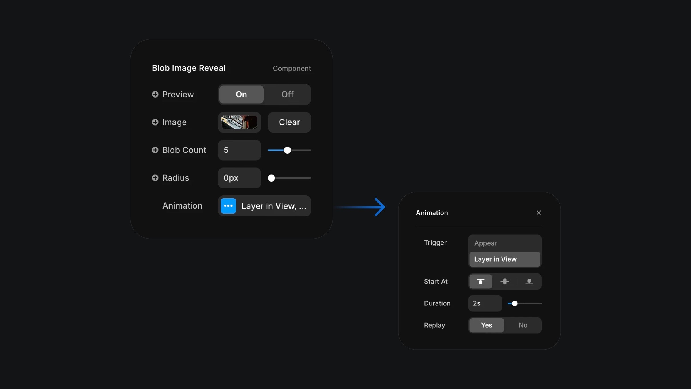
The component properties of the blob image reveal component.
The component properties of the blob image reveal component.
The component properties of the blob image reveal component.


